Katherine Joy

Katherine Joy
Branding & Collateral
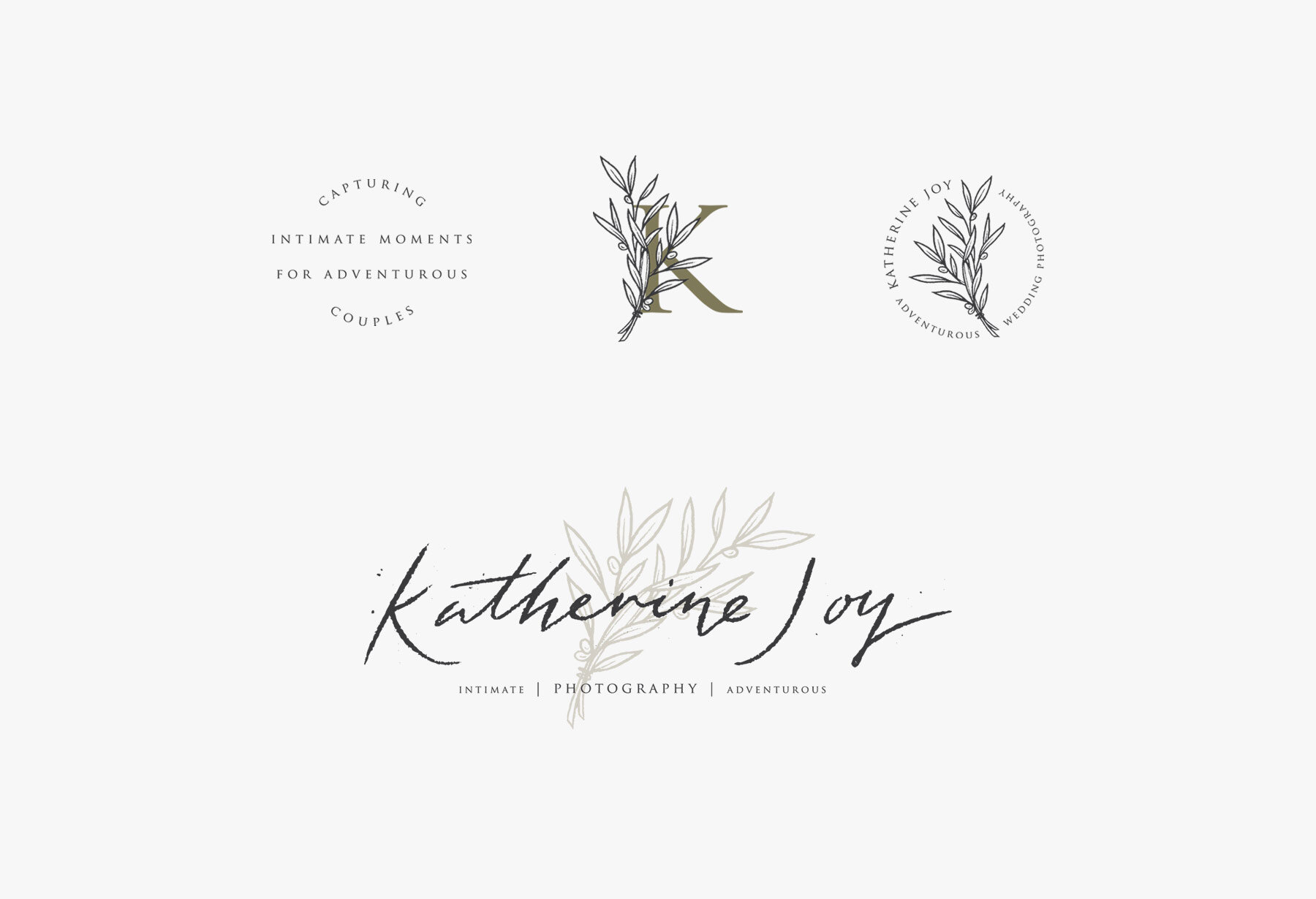
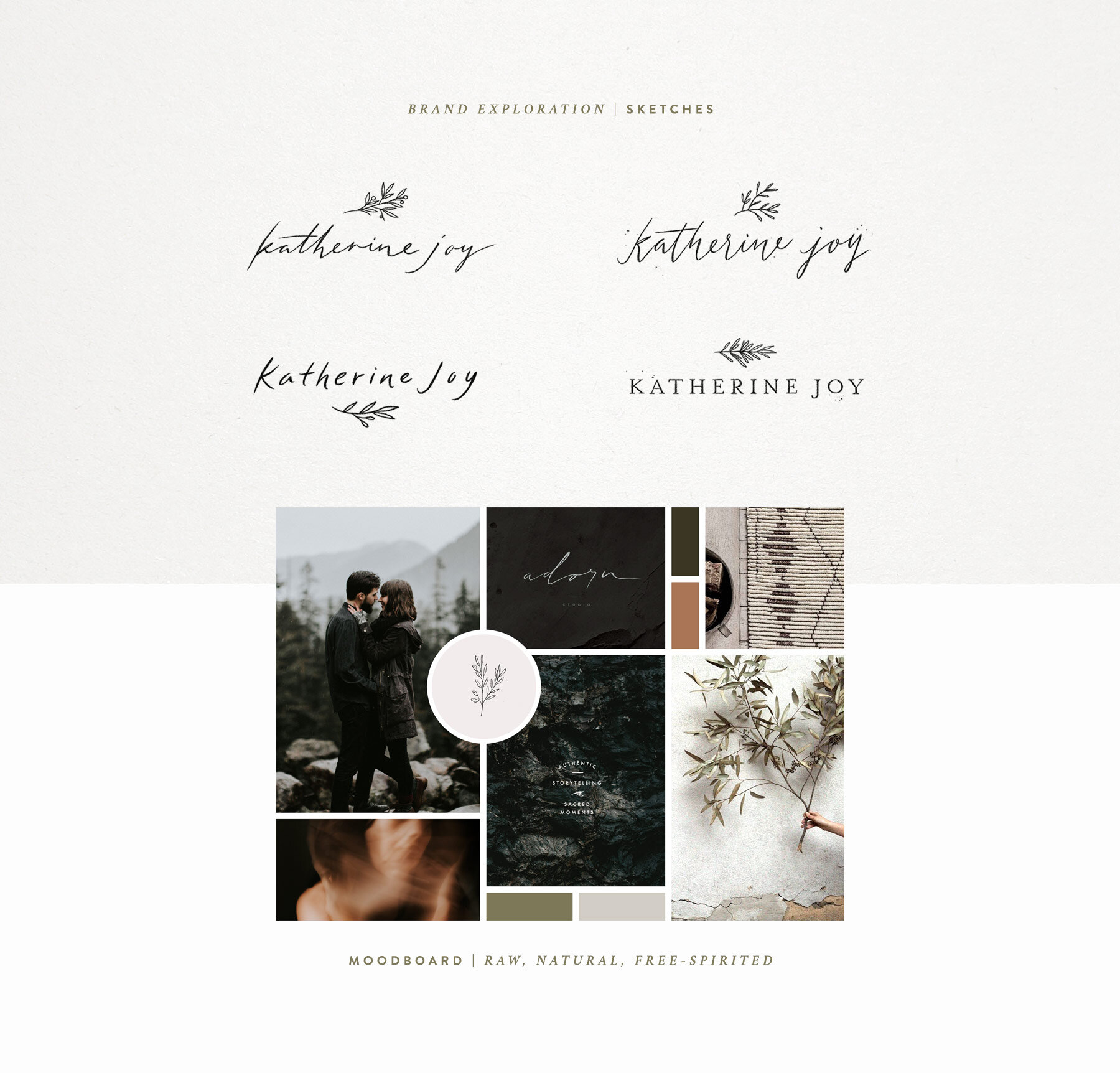
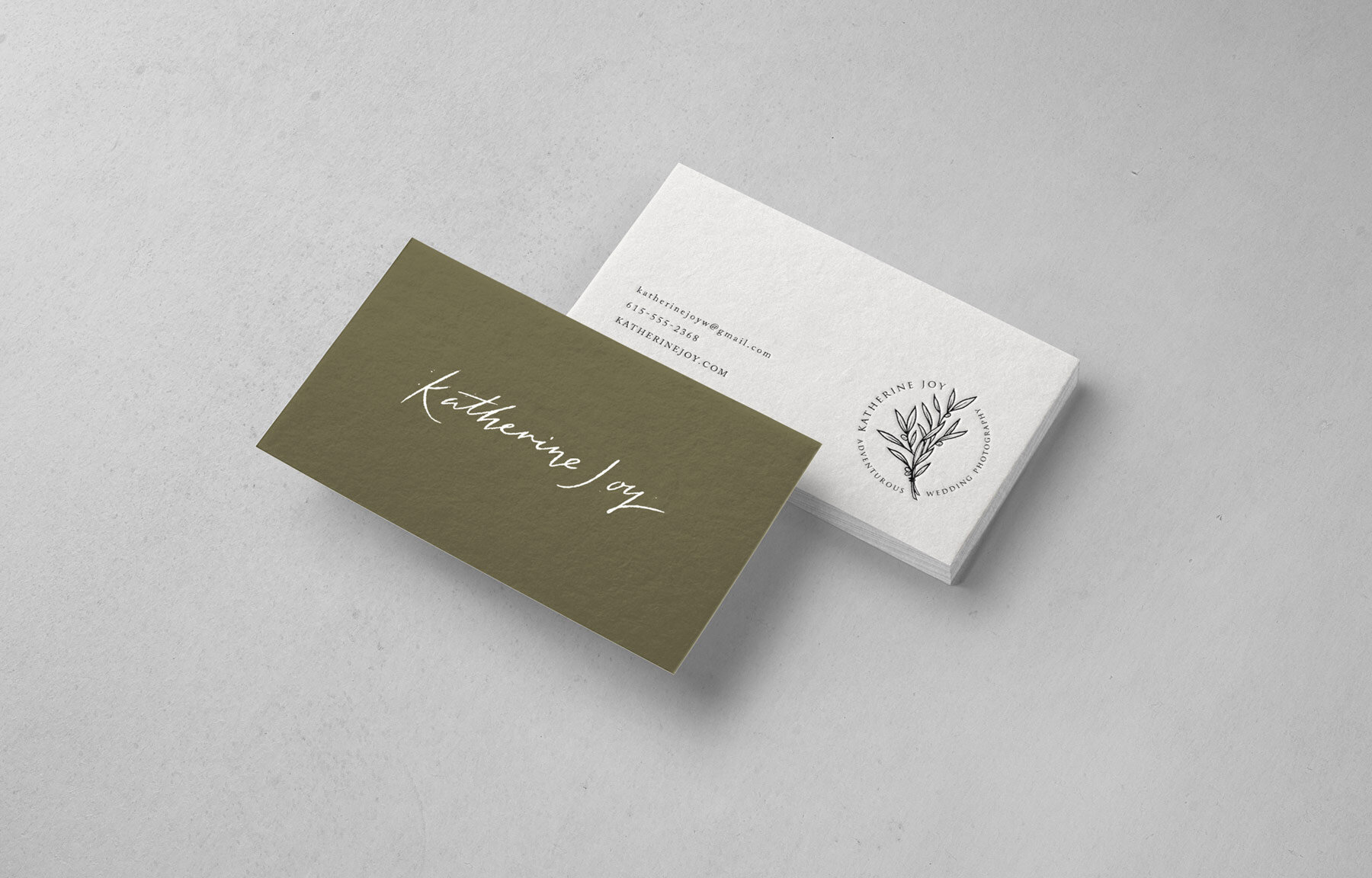
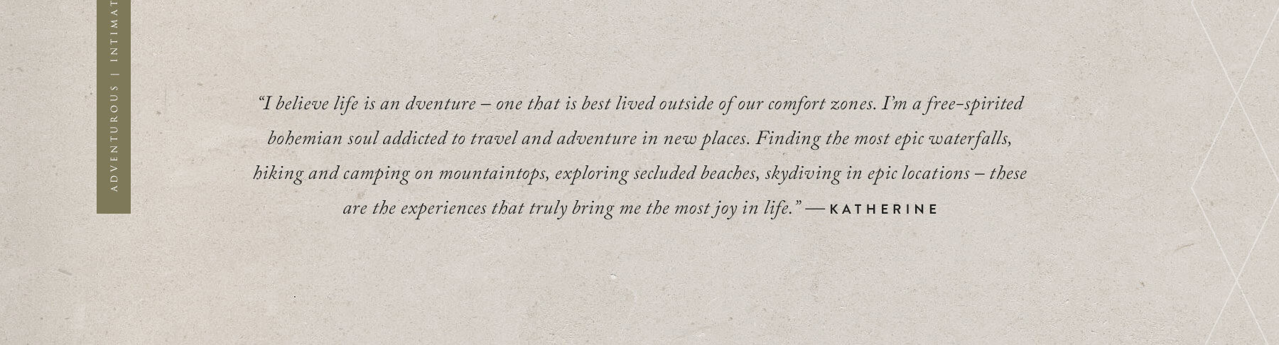
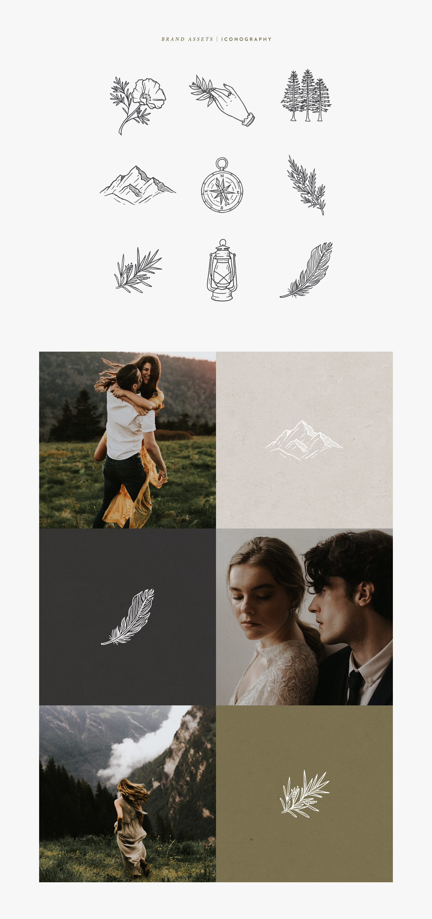
Katherine Joy is a wedding, elopement, and lifestyle photographer based in Nashville. Her work is raw and emotive with an adventurous flair. She needed a logo that could combine her bohemian heart with the beautiful nature she surrounds herself with. The loose calligraphic style keeps it feeling free-spirited and personal, and the roughness adds to the outdoorsy nature of the brand. Warm green and taupe colors are frequently found in Katherine's work as well as in nature. Color psychology also suggests these tones evoke feelings of positive energy and harmony, reflective of the way couples and models should feel while working with her.
Services
Brand development
Logo identity
Print collateral
Illustrations