Misunderstood Whiskey Oat Nog

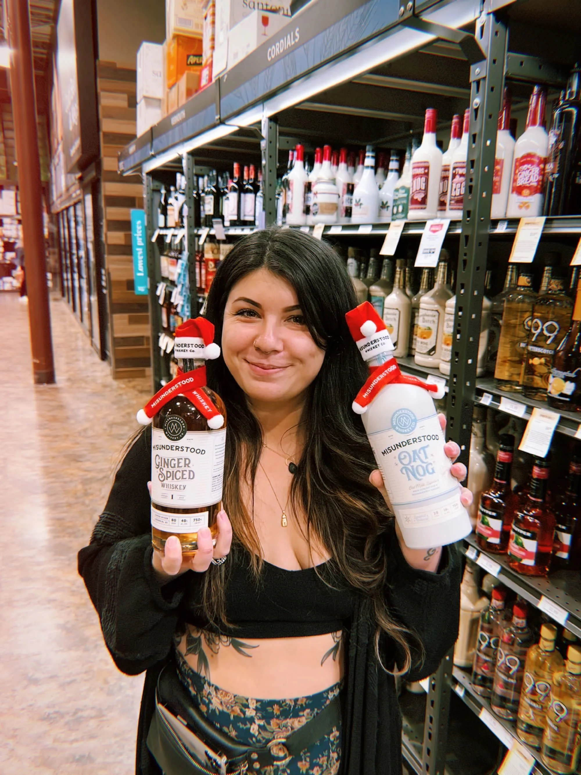
So excited to finally get my hands on a bottle of the Oat Nog release I designed for Misunderstood Whiskey! I had to make a trip to the liquor stores just to see it sitting on a real-life shelf. And let me tell you, seeing my designs in the wild is something I’ll never stop geeking out over.
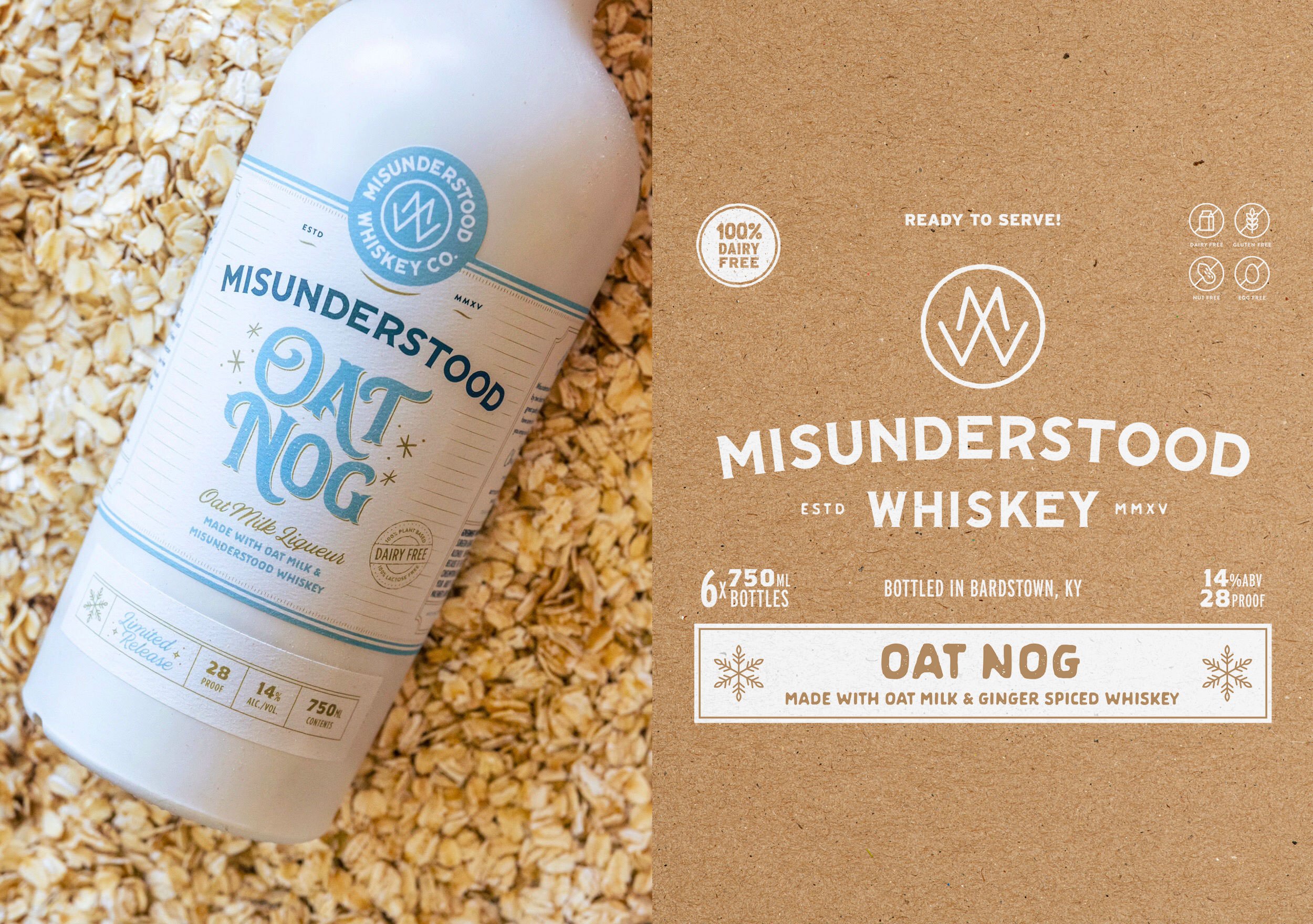
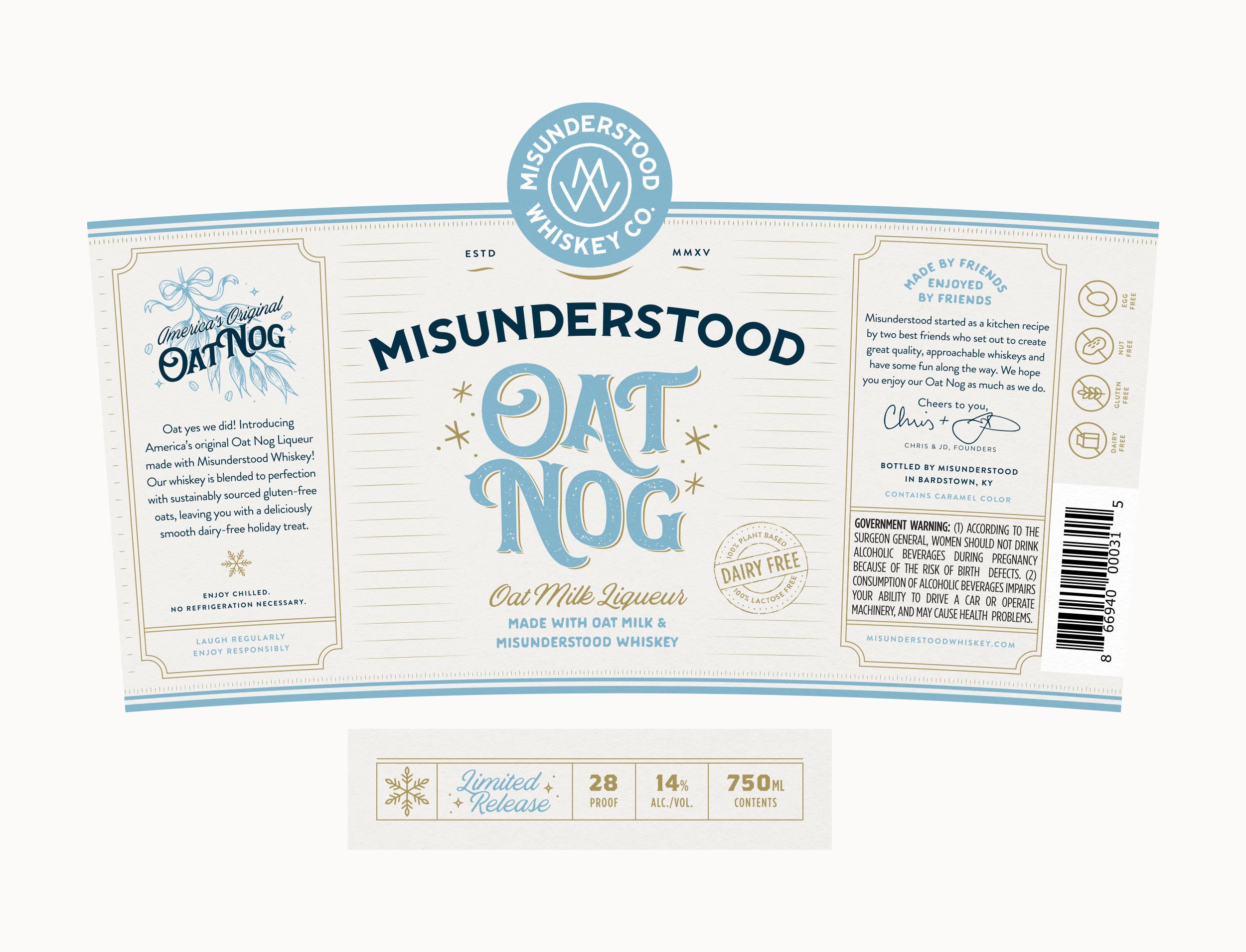
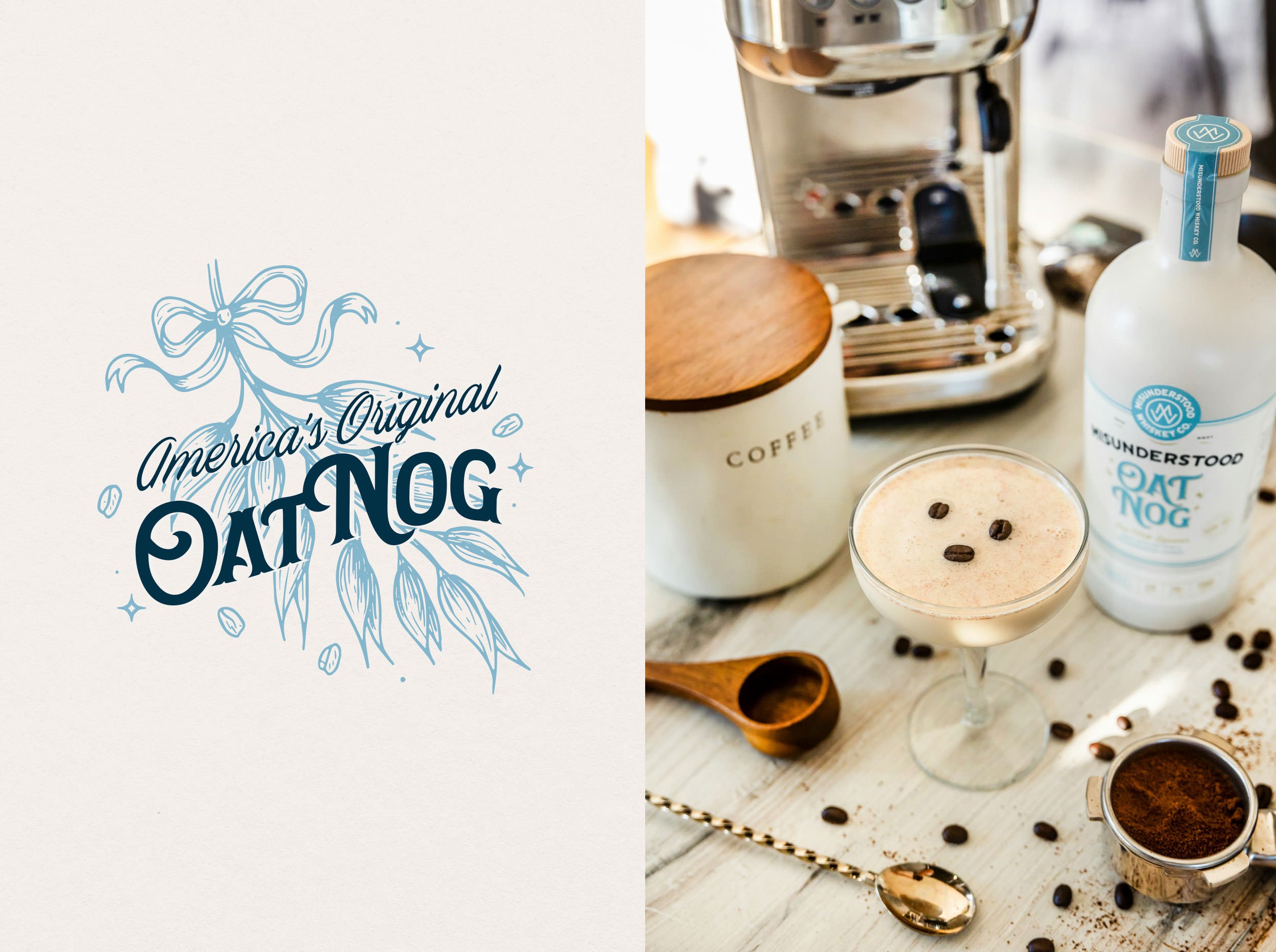
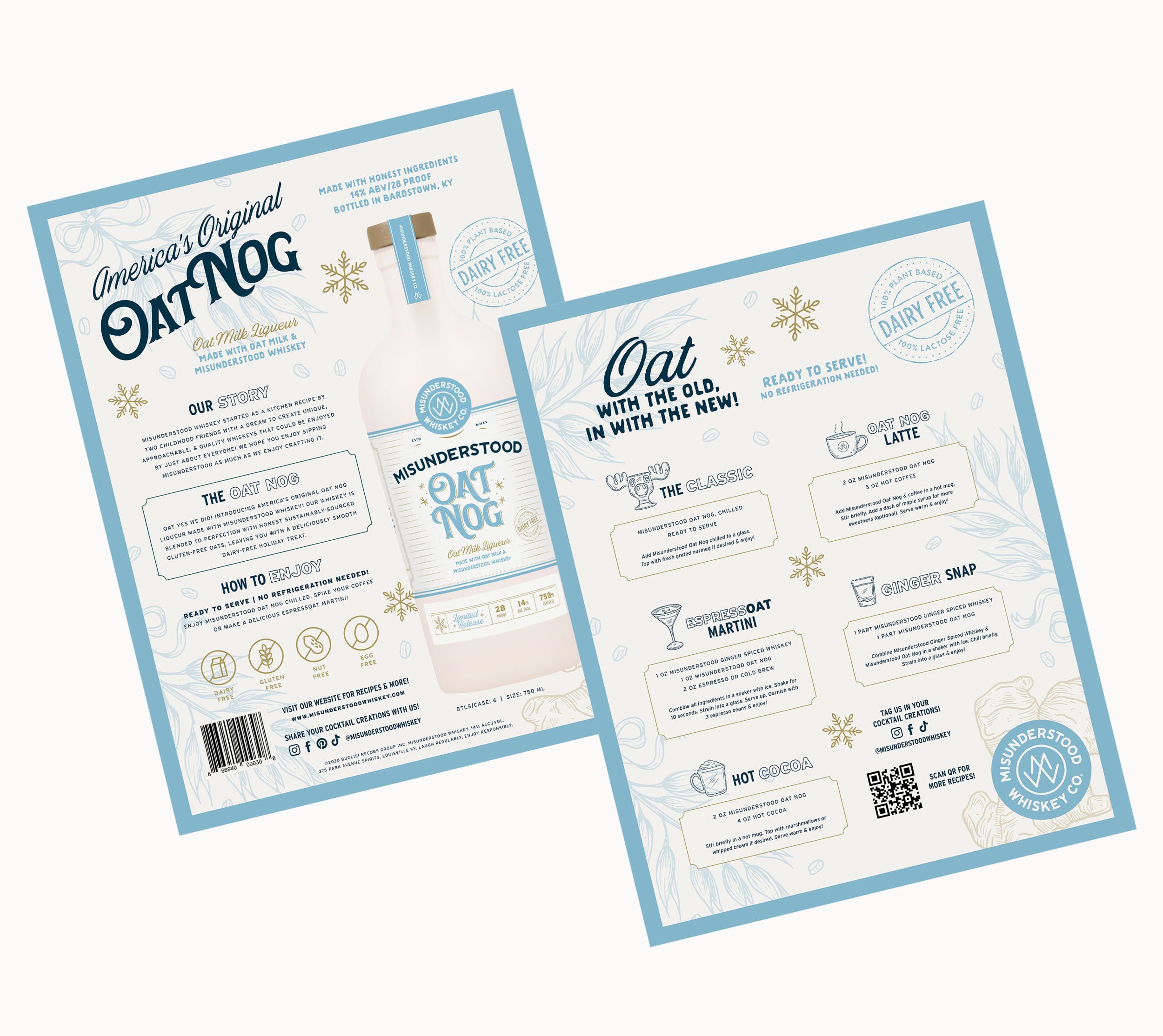
For this release, we wanted the design to be all about capturing that cheery, laid-back vibe of winter holidays and good times with friends. Rather than falling back on blatant holiday imagery, we leaned into more wintery motifs – snowflakes, sparkles, and that kind of magical energy of the season.
Adding a light refreshing blue to Misunderstood’s existing color palette helped evoke that cold, wintry essence while also while also being an immediate cue we’ve come to associate with oat milk, making it stand out on the shelf as a dairy-free liqueur. We used kraft brown across other touchpoints to give it that organic, homegrown feel while hinting at the plant-based nature of the product. The whole design comes together in a package that’s as inviting and refreshing as the drink itself.
Super proud of this piece and already craving another ginger snap cocktail! You can now pick up a bottle at most liquor stores near you. Check out misunderstoodwhiskey.com/oat-nog for more info.
SERVICES
Branding | Illustration | Packaging Design